Visualizing Constructive Activism for SPUR Value Partners

Creating an identity for a new fund is rarely just about aesthetics; it is about translating an investment philosophy into a visual signal. When Till Hufnagel and Janus Intelmann approached me to brand their new venture, SPUR Value Partners, the objective was clear: define the visual language of constructive value creation.
Till Hufnagel, having left Petrus Advisers after a decade to launch this venture, brings a specific pedigree to the market. Along with Founding Partner Janus Intelmann, the team applies a private equity approach to public markets—a strategy that requires patience, rigour, and deep engagement.
The Challenge: Defining “Active”
SPUR Value Partners is not a passive capital allocator. They are actively engaged investors specializing in listed European mid-market companies. With a concentrated portfolio of just 8–12 companies and an investment horizon of 3–5 years, their strategy relies on thorough due diligence to develop a proprietary perspective on every business they touch.
The branding challenge was to capture this balance. The identity needed to feel:
- Established: Reflecting the team’s 10+ year track record.
- Incisive: Signalling their willingness to engage deeply (and publicly if necessary).
- Constructive: Distinguishing them from “raiders”—emphasizing their goal of creating value for all shareholders.

Strategic Alignment
The design process mirrored SPUR’s own due diligence. Working closely with Till and Janus, we stripped away the superfluous to find the core mechanic of the brand.
We focused on the name itself: SPUR. To spur is to urge, to encourage, and to accelerate. However, visually, we wanted to avoid the cliché of a western cowboy aesthetic. The metaphor needed to be mechanical, not equestrian.
The concept we aligned on was The Gear.
In the context of the European mid-market, SPUR Value Partners acts as a missing gear in a machine—a catalyst that unlocks trapped value and gets the mechanism moving again. This aligned perfectly with their operational approach: engaging with leadership teams to drive improvement potential.

The Solution: A Mark of Precision
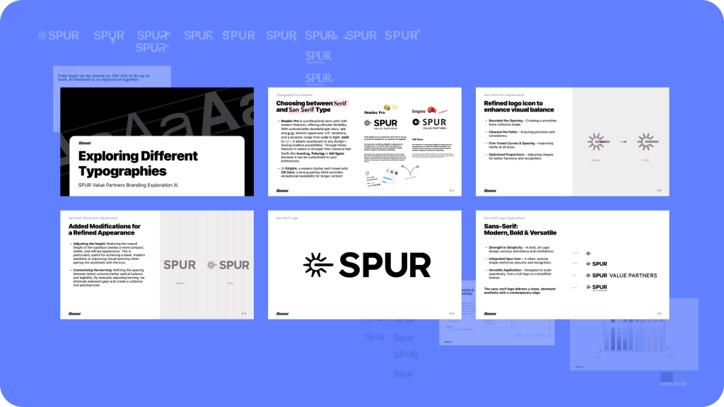
The final identity centres on a custom wordmark and a proprietary icon.
The Symbol We developed a custom “gear-shaped spur.” It is a geometric, engineered mark that suggests motion and interaction. It signals that SPUR is an integral part of the machinery of the companies they invest in, not just an outside observer.
The Typography To reflect the fund’s “private equity approach,” the typography had to be immaculate. We avoided trends in favour of timeless precision. The letterforms are sharp and authoritative, creating a sense of stability.
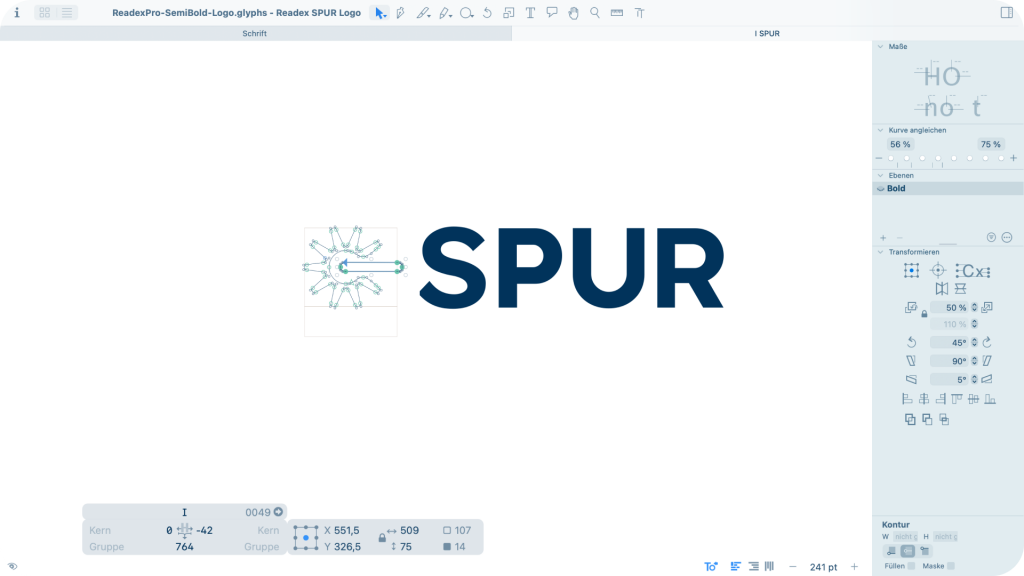
The Execution Just as SPUR applies a “proprietary perspective” to their investments, we applied a proprietary approach to the finish. I utilized Glyphs App—typically used for typeface design rather than logo design—to finalize the mark. This allowed for mathematical precision in the kerning and the weight of the icon, ensuring the “gear” locked into the typography with absolute optical balance.

The Outcome
In November 2025, SPUR Value Partners launched their first open-ended vehicle, offering investors access to their European activism strategy in a liquid format.
The resulting brand identity serves as a clear flag in the market. It represents a fund that is disciplined, constructive, and engineered for long-term value creation. It is a brand designed not just to be seen, but to work.